So! If you’re paying attention, you’ll notice my illustrations have improved a great deal since I purchased a Surface Go with a stylus. This is because now I am able to cheat. However, artists have been cheating this way for a long time, like Vermeer. I just have better tech. I’m going to unpack how I produce an illustration for you, so you know. You can use this method of illustration yourself, and I don’t mind if you cannibalize my images for it (just profit share 50/50 with a charity if you sell them and Be Excellent). Fair warning, the stock photo people may mind, depending on how much your end product resembles their end product. But I promise you I won’t come after you for use of my designs and illustrations, as long as you’re not hurting anyone.
I am purchasing my stock photos from Dreamstime.com, as well as using their library of free images whenever possible and, increasingly free-images.com. I also use vector images from PublicDomainVectors.org. I will try to give you a heads up when an image uses all Public Domain stuff, so you can remix it with impunity. Paint.net is my editing software of choice and LibreOffice is what I use to create large blocks of text, such as my modified song-lyric backgrounds.
What follows is my process for creating a typical illustration. It takes several hours over two to three days at least, longer for multiple figures and complex backgrounds. If I were paying myself a fair wage, I could not afford to hire me. This is why it is cheaper for me to buy stock images than to hire an illustrator. I am not an art person. I have minimal training and ‘poor fine motor skills’ is the one feature of my developmental disorder that they were able to identify in school. I’m compensating, as you will see.
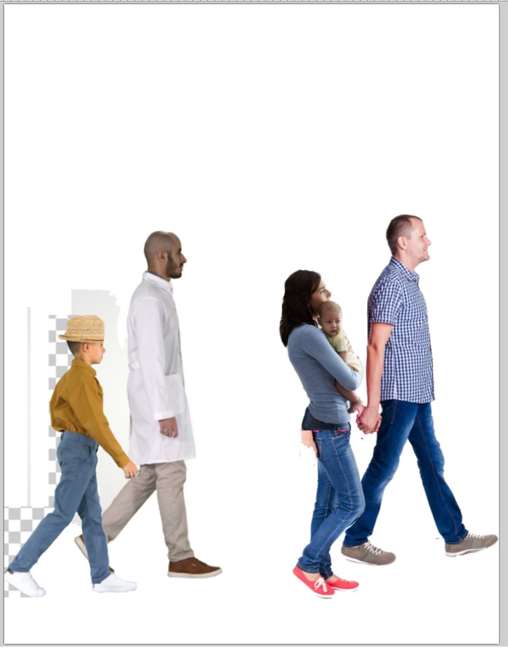
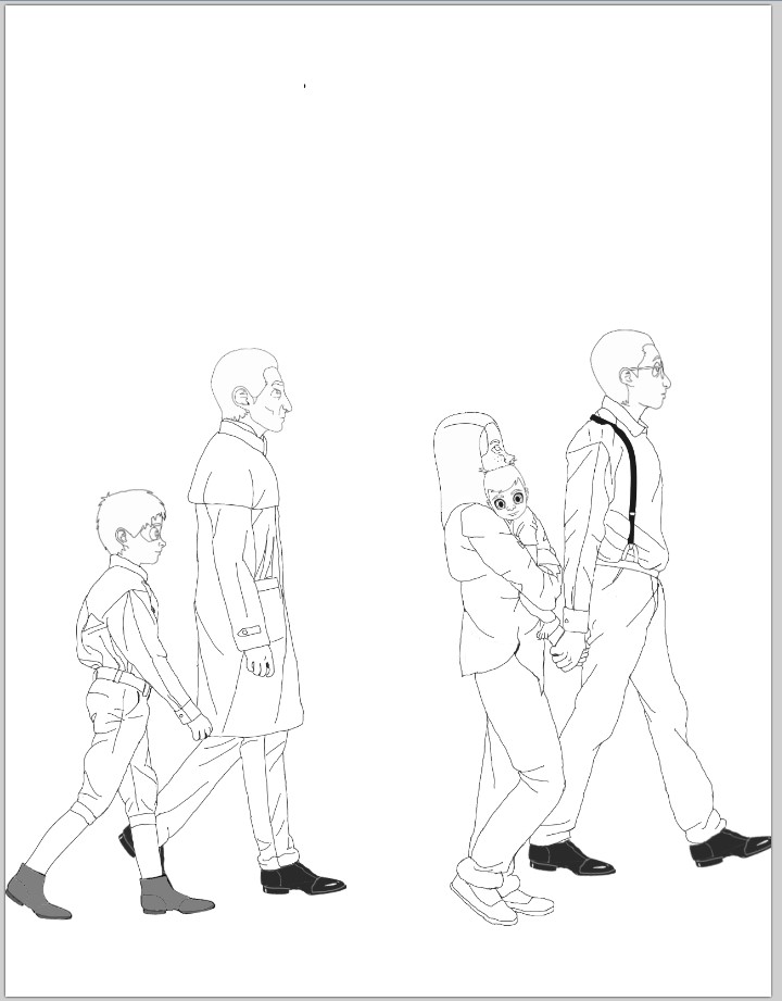
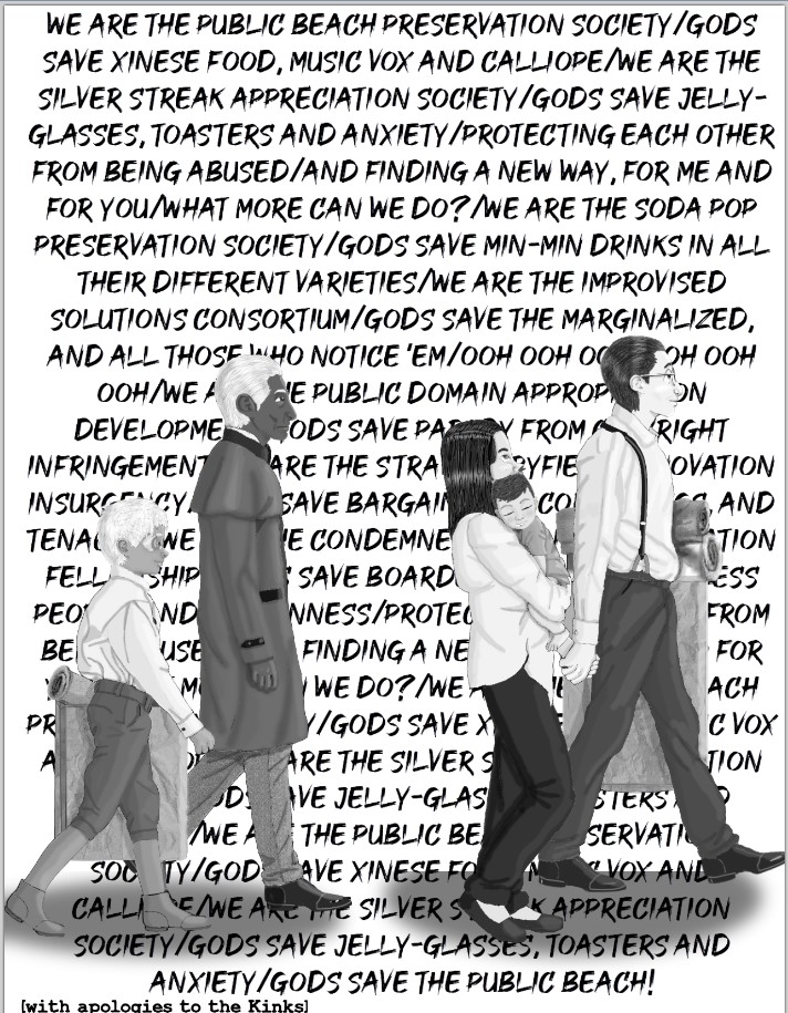
This first image represents quite a lot of work. The base ‘photo’ in this case is a collage of five stock photos which I needed to find, isolate, scale to the approximate size of the characters, and arrange to tell the story I had in mind. Milo, Calliope, Lucy, Erik and Mordecai are going to the beach! I got lucky and found a cute couple walking and holding hands, but I couldn’t find a woman holding a baby and walking, so I had to remove a torso and replace it. Milo is also a foot taller than Calliope, so I had to cut my cute couple in half, put each on their own layer, and play with their sizes individually. This is just to start!
My default size for image creation is 8.5 X 11 inches, at 150 dpi. You may have a higher resolution if/when I get better at drawing. 150 is what’s comfortable for me right now.
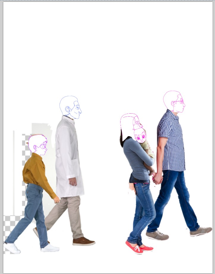
Next, it’s time to add character heads. I keep separate files with each character’s face in simple lines and a neutral expression, in three basic orientations (ideally three, I add them as I need them). I’ve created 3D mockups of each head in Sims 3 to help me keep track of the rotation of their features in space. These new designs split the difference between my cartoon-like originals and a more realistic style that’s more suited to the shading I’m able to do now.
Lucy’s simple head always gets me singing “Damn, that’s an intense baby!” (to the tune of ‘Damn, That’s an Ugly Baby’) because her eyes are huge. I need them that big so I can carve bits of them away to give her expression, and to give her that starry-eyed anime look which contrasts so well with a spider mecha.
Next, I need to pick a high-contrast color and trace my base image. I usually use hot pink or purple. Depending on complexity, I may do this on the head layer or on a third layer. I default to a 2px brush, but because everyone is so small in this image, I used a 1px. That made it even harder for me to match up my wobbly lines.
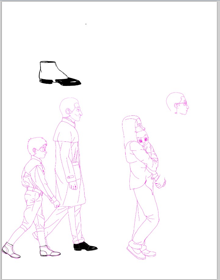
You will notice I had a hard time producing a shoe I was happy with for Mordecai — he wears wingtips, the stock model is in sneakers. After playing around for a while, I went running to Public Domain Vectors and found a closer shoe, pasted into its own layer above. I modified it to produce wingtips for Mordecai — and Erik’s boots and Milo’s oxfords! I saved my modified shoe and boot in a separate image file for later. You’ll probably see them again!
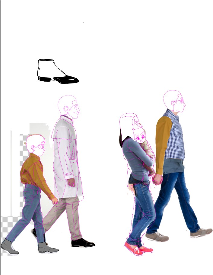
Milo also needed long sleeves and a tucked-in shirt. I stole a sleeve and a waistband from Erik’s model to approximate this. Sometimes I just freehand minor alterations and clothing changes, as I did with Mordecai’s greatcoat and Calliope’s outfit. When possible, I like to add something to the base image so I can scale it and play with it. It was hard for me to place that waistband, and you’ll see I still wasn’t happy with it as it appears here.
When I have an outline I’m happy with, it’s time to convert it to black — first with the Black and White filter, and then Brightness/Contrast to darken it up. After working in a warm color for so long, black always looks green to me. Sometimes I have to sample it with the eyedropper to make sure I did it right!
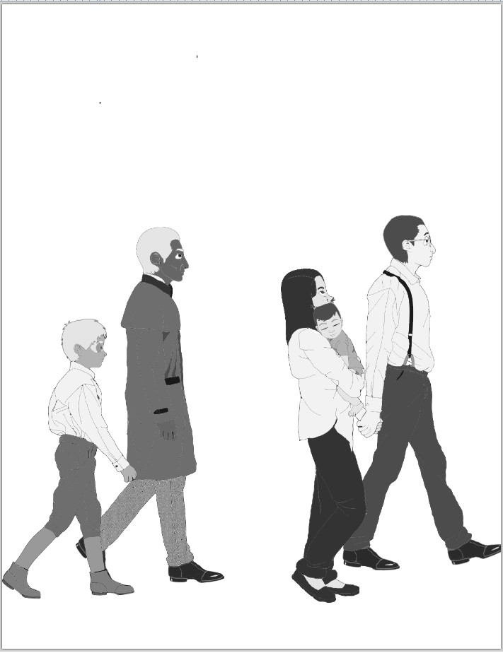
I have a palette of 12 shades of gray from black to white that I use to ‘color’ my outline with the flood tool. (Yes, I frequently flood the whole dang image because I failed to close a line!) I also have an add-on which allows me to do a pattern fill from the clipboard, which is how Mordecai gets his herringbone trousers. Except for eyes and teeth, I fill ‘white’ with 95 V (on HSV sliders) gray so I can add highlights. Milo’s skin tone is also 95 V gray, because redheads are not known for their melanin.
I’ve started to add facial expressions and you’ll find Lucy is a lot less intense with her eyes closed!
I forgot Erik and Milo were carrying bags! I forget things a lot, some of which even make it into the final images. I try to save a raw file with as many intact layers as possible, so I can fix things later. In this case, I had already married Mordecai and Erik’s outlines with no bag included. If I rewound via the undo history I’d lose the work I did on the shoes, so I had to do some complicated erasing. That paper texture is from the Public Domain. I think Erik’s bag makes sense if he’s got the handles over his arm. Milo’s bag makes less sense where it is, but it’s harder for me to play around with placement when I leave stuff out like this. It’s close enough, I hope.
It is also right around here that I found out Trump supporters were storming the Capitol and I had to hang it up for the day and glue myself to the news. Real life does have an impact on the image quality I deliver! I usually do my drawings the week before I need them, finishing up on Saturday evening before posting the installment that goes up at 12:01 Sunday.
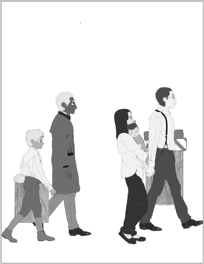
Hair! The way I do hair is really low tech and stupid. I do a ‘lite’ layer (Lighten, 100% opacity) and a ‘dark’ layer (Multiply, 100% opacity). With a 1px brush I scribble highlights and lowlights in the approximate direction of the hair arrangement on each layer, and then scribble over the scribbles with a 1px eraser. When appropriate, I add shine with a larger brush, either on the existing lite and dark layers with a transparent color, or with a secondary layer of lower opacity which I merge down. Then I merge everything to the base layer so I don’t have to keep track of extra lite and dark layers. I can pile up quite a few depending on image complexity, and I WILL screw up and start editing the wrong layer at least once on every image.

Shading! And I finally took the Valium out of everyone’s expressions. I usually fix expressions a lot earlier than this, while I’m doing the outlines, but I had so few pixels to work with on the faces here that I did most of the alterations with just shade on the dark layer. I have one ‘lite’ layer and one ‘dark’ layer, as when I do hair — but I might add more depending on what the clothing textures need. Glitter and pleats/ruffles get their own layers so I can freely employ the Noise and Gaussian Blur effects.
I am still deciding how to render clothing wrinkles. It is really hard to do them in Paint.net because it lacks a Smudge tool, and I can’t blend with a fingertip like a piece of paper. I can do brushes and erasers of varying opacity, which helps, but doesn’t work at all the same. Creating really real shading effects is too labor-intensive and beyond my skill level. I’m aiming for a manga splash page look, with pattern fills providing faux screentoning. I have to pick and choose which wrinkles to copy from the base images, and then shade them as if the light is coming from where I’ve decided it’s coming from. This, plus variations in clothing types, styles and patterns, is why I have to trace, color and shade instead of just converting a photo to black and white and doing everything collage-style. My base image is a collage, used to produce a modified collage. Sometimes I’m able to use vectors without tracing them, but I always have to recolor and shade.
Much of the actual tracing I did gets erased while I’m shading, merely acting as a guide for where I need a shadow. But I really need that guide! Notice what I did to make the towels look rolled up — that’s a copy, past and recolor from a Public Domain image of a rolled towel, because I was driving myself nuts trying to freehand a rolled up towel end. (And, you know, I was still concerned our democracy was going to collapse for the rest of the week. It’s hard to pay attention sometimes!) I am not spatial. Even when I was producing pen and paper drawings, I needed multiple reference images, many of which I cut up and modified to produce collages which I am now able to trace directly.
(Full disclosure, my redraws may contain pieces of reference images I sniped from GIS and did not pay for. I have a lot to redraw and it’s not worth it to me to do a new base image from scratch to create a similar image when the original has probably been modified enough that no one will ever recognize it, and the creator would only get a few pennies anyway. I may regret this decision later, but if you don’t use my stuff commercially you shouldn’t get in trouble. I will label things that are cribbed entirely off the Public Domain and are thus safe for commercial use.)
Song lyrics! I used to use the unmodified lyrics from the songs I was referencing, but the Music Industry doesn’t like that and I have no money to pay for a lawsuit. These days I’m creating plot-relevant parodies, which should leave me in the clear. That does mean every illustration with a lyric background from before 9/13/20 had to be taken down. I will slowly replace them with redraws.
I do my writing and Milo’s cards in Google Docs. (Milo’s cards occasionally need modifications in Paint.net.) For more complicated text formations, I need the draw feature of LibreOffice. It’s a little awkward, but it does let me edit text boxes like a word processor and control the dpi of the output. Even though I save it as 8.5 x 11 at 150, it’s always a little small when I open the PNG in Paint.net. The resizing doesn’t hurt it too bad, thank goodness. I select all and paste into a new layer, with the editable text version still open in another window in case I screwed up. Unless I forget.
- Milo’s handwriting is Shadows into Light Two, licensed from Kimberly Geswain and free for non-commercial use.
- Erik’s handwriting is Architect’s Daughter, same as above.
- Mordecai’s handwriting is Nothing You Could Do, same.
- Hyacinth’s handwriting is Amatic SC by MistaWonky, 100% free.
- Seth’s handwriting is Cutesy by Artsy Cat, with some cursive-like joins added freehand, 100% free.
- The brush font I use (after January 2021, pending replacement of Brush Some in redraws, because it’s too expensive) is Good Brush by Sarah Robbaniyyah, 100% free.
- The typewriter font I use (After January 2021, pending replacement of Courier New in redraws because its licensing has odd wording and I prefer to be safe, also the new font is more condensed) is Type Wrong by Digital Graphic labs, 100% free.
- I will list other fonts here as needed, and I’ll try to keep ‘em free.
Most of my shadows on the ground are lazy circles, unless I’m trying to match a photo background. I think anything more detailed distracts from the text backgrounds, and I’m trying to keep my ‘look’ semi-consistent. I add yet another layer, draw under feet with the ellipse tool, Gaussian Blur, and snip some of it off to suggest the ‘floor’ ends somewhere in the back. Then I can play with the opacity however I need to keep everything legible.
I’ve tried to do a true text wrap around the figures so you can read everything, but I gave up waaay back when I tried to do it for ‘Limelight’ and Ann’s murder. It’s just too hard for me to do with the software I have available, so full lyrics will need to go in the Liner Notes for you to peruse. It makes things a little more accessible too, although my accessibility is still pretty dismal. I’m doing my best, but my use of italics for private thoughts and also mental communication must give text-to-speech readers a real headache, if they even bother.
I always offer the original composers my apologies, they deserve some credit for my abuse of their work. I’m more ambivalent about paying a distributor, such as I must do for the stock images. The people who actually did the work will get pennies per photo from my subscription, but they wouldn’t be able to sell their work on their own and I wouldn’t be able to find it and use it, so the lion’s share goes to Dreamstime. As far as the music goes, I can’t afford it. I might, I MIGHT, in the future attempt to purchase five words from ‘Yes It Is’ and a couple lines from ‘Dum Dum Diddle,’ but chances are I’ll just have to work around the music forever.
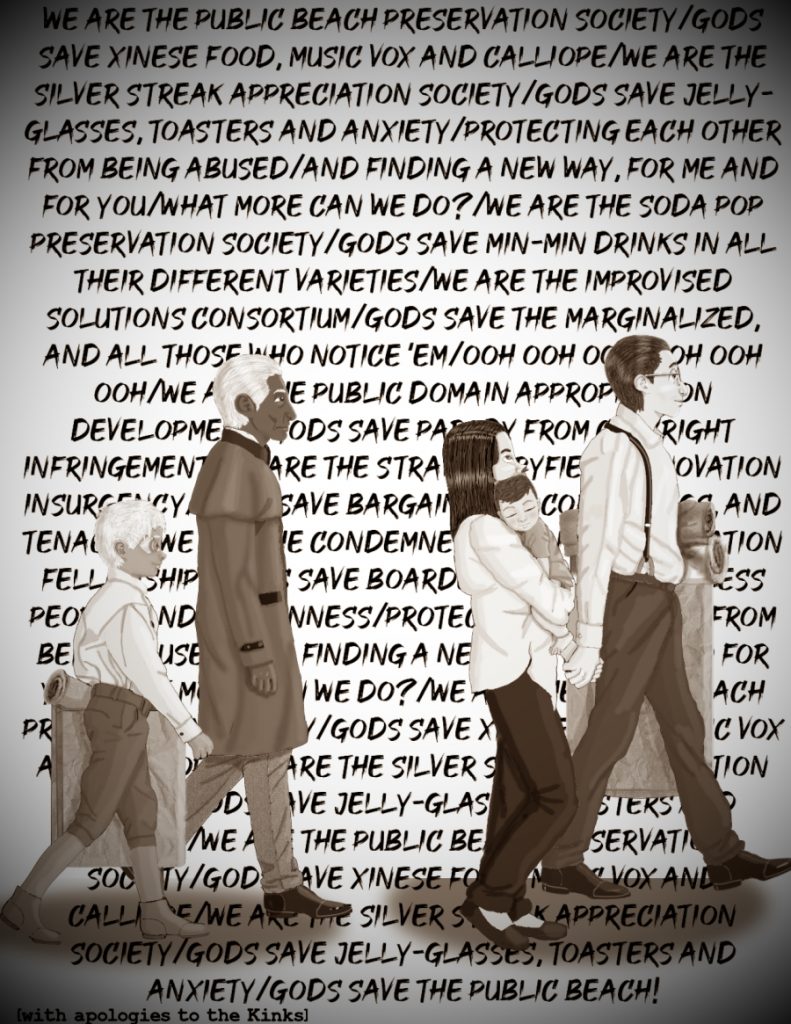
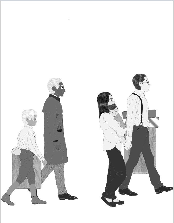
Final image! Semi-final, because I do find errors and I save a raw so I can edit more easily. When I flatten, I save as a new image, in JPG format. (Sometimes I slip and hit ‘Save’ instead of ‘Save As,’ so I have to do a little dance with my undo history.) Then I convert to sepia, add the Vignette effect and resize. Sometimes my vignetting is a little more complicated, like when I want to replicate the old photos that had a bust or a torso fading away to a neutral background instead of just black. I try not to do that in the raws, but sometimes I forget. Also, sometimes I reverse order and do my Sepia filter AFTER the Vignette effect, which makes the fading black look brown. There are a few of those in final images which, for complicated reasons, I was unable to find and fix. Maybe I’ll get ‘em when I do the redraws, but I bet you I still miss a few!
Altogether, this image took me about 10 hours and three days, not counting searching for the images and producing the character heads, which I did earlier. Actual productive time on this one is a little iffy because of the insurrection. Nymphadora, from the installment before this one, took over 12 hours. When I hit 12 I got embarrassed and stopped counting. $180 at a $15/hr minimum wage! I cannot afford to pay someone to do what I’m doing, that’s why I’m doing it. I also couldn’t do it at this level without the base images. I’m trying to tell you a story, with everything in service of that story. For right now, that means a lot of time spent getting the illustrations as descriptive as possible, and some non-traditional (perhaps controversial and morally ambiguous) methods. But I am putting a whole lot of work into this stuff, regardless.
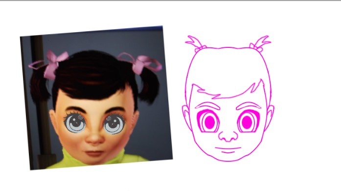
Just to make it an even 13, because that’s an arc number of mine, here’s Lucy’s reference head vs. her simple linework head. I either paste eyes from the original character model or generic anime eyes over the Sims eyes, after racking up the eye area as large as possible to make room. Base eyes in a separate layer help me get the scale right, it’s almost always larger than the Sims would allow. I aim for a linework expression which makes it look like I’ve fed the character a couple Valium, with the mouth curving towards a smile or frown if the character does a lot of smiling or frowning. The actual shape of the linework head may also vary wildly, just not too much for Lucy since she’s a baby and she really shouldn’t have much of a chin. The reference is mainly so I can keep track of where the eyes and nose (and in Lu’s case, pigtails) go as the head turns.
My characters with accessories, like Milo and Hyacinth, get their add-ons in a new layer which I can turn on or off. Calliope also has two sets of hair and ears, one for her hair pulled back and one for it down. I may eventually get around to doing that for Ann, but I usually just use Milo’s ears for her. For expressions, I use my original character sheets as a reference for my main cast. For the others, I look in a mirror and make things up.
I am going to have a LOT of heads. I already have a lot of heads. I hope I don’t have to redo these designs for a long time. Pray for the Sims 3 and Origin to remain solvent, otherwise I’m going to have to sculpt ‘em IRL like the Lu-ambulator V3.